
Snapshot plots: displaying summary tables as parallel univariate plots with consistent color highlighting
Source: arXiv:2607.28302 · Published 2026-07-30 · By Matthias Schonlau, Sandra Huang, Tiancheng Yang
TL;DR
This paper addresses the challenge of visualizing "Table 1" summary tables commonly used in social and health sciences to show sample background characteristics and group comparisons. Traditional "Table 1"s display aggregated numerical and categorical data in a static tabular form, which can be difficult to read and compare visually, especially when highlighting subgroup differences. The authors propose snapshot plots, a novel visualization technique that displays parallel univariate plots with consistent color highlighting across variables. Snapshot plots combine stacked bar charts for categorical variables and boxplots, violin plots, or lumpy rugplots for numerical variables. They allow readers to visually compare marginal distributions and group differences simultaneously, providing richer detail than traditional tables. The authors provide a Python implementation, a web app, and demonstrate snapshot plots on two real-world datasets, showing that they can reveal patterns and highlight significant group differences more clearly than standard tables. Snapshot plots also scale well, handling up to 10,000 observations efficiently.
Key findings
- Snapshot plots visually display 5-15 variables in parallel, meeting typical Table 1 size (design requirement R1).
- Stacked barcharts are used for categorical variables with side-by-side highlighting to facilitate group comparisons (R4).
- Numerical variables can be shown with boxplots, violin plots (half-violin per group), or novel lumpy rugplots to reduce overplotting.
- Missing data is visualized in a dedicated bottom row to show extent of missingness (R3).
- Snapshot plots run efficiently at large scale: 0.75s for 10,000 rows and 14.2s for 1 million rows on a laptop.
- Snapshot plots reveal significant group differences consistent with p-values in the asthma study, e.g., age and race distributions differ between intervention and control groups.
- In the literacy dataset, snapshot plots visualize distributions of numeracy, reading, and other skills with highlighting for education levels.
- Snapshot plots arise as an edge case of hammock plots, removing bivariate connectors to focus on marginal univariate summaries.
Methodology — deep read
The paper’s core contribution is a design and implementation of snapshot plots as a visual alternative to traditional Table 1 summary tables. Threat Model & Assumptions: The adversary concept is not applicable as this is a visualization design paper focused on clarity and interpretability rather than security.
Data: Two main datasets are used to demonstrate snapshot plots: a literacy dataset with multiple numeric (numeracy, reading, speaking, listening scores) and categorical (race/ethnicity, gender, education) variables, and an asthma study dataset with intervention/control groups, multiple categorical demographics and health variables, and significance tests. The literacy dataset was also replicated synthetically to test scalability up to 1 million rows.
Architecture/Algorithm: Snapshot plots arrange variables as parallel vertical axes representing the marginal distribution per variable. For categorical data, stacked bar charts are drawn with groups highlighted side-by-side to show distribution proportions. For numerical data, users can choose among boxplots, violin plots (split by group for highlighting), and lumpy rugplots—an innovation where tick marks represent counts as rectangular bars to reduce overplotting in densely repeated values. Missing data percentages are shown in a dedicated horizontal row at the bottom.
Training Regime: Not applicable; no machine learning model training involved.
Evaluation Protocol: The authors compare snapshot plots visually and qualitatively to classic Table 1s, highlighting how numerical variable distributions show richer detail (e.g., violin plots reveal distribution shapes rather than just means). p-values from statistical tests in the asthma example confirm that visually detectable group differences match formal significance. Performance was measured by rendering times at scale.
Reproducibility: The Python source code is publicly available on GitHub with a PyPI package. The web app is hosted online. The paper includes replication data and materials to reproduce the snapshot plots.
Example Workflow: For the asthma data, variables such as age and race are displayed as parallel axes. The intervention group is highlighted in color across all plots. Boxplots show age distributions centered lower for intervention patients, confirming the reported significant difference (p < .0001). Stacked bar charts for race show proportionally fewer white patients in the intervention group, again consistent with significance tests. Missing data proportions appear at the bottom. Overall, snapshot plots transform marginal summary tables into visually intuitive, parallel univariate plots with consistent group highlighting to aid exploratory analysis and presentation.
Technical innovations
- Introduction of snapshot plots combining parallel univariate visualizations to replace Table 1 summary tables.
- Use of lumpy rugplots for numerical variables to mitigate overplotting by replacing tick marks with width-scaled boxes.
- Consistent color highlighting across variables to link observations by groups, facilitating cross-variable comparison.
- Application of side-by-side highlighting in stacked bar charts for categorical variables to enable easier proportion comparisons among groups.
- Identification of snapshot plots as an edge case of hammock plots by removing bivariate connectors to focus solely on marginal summaries.
Datasets
- Literacy dataset — original size not specified, replicated to 10,000 and 1 million observations — publicly available in replication materials
- Asthma study dataset — 511 survey respondents split into intervention (N=385) and control (N=126) groups — available in replication materials
Baselines vs proposed
- Traditional Table 1: p-values reported for group differences vs snapshot plots: visually reveal corresponding significant differences with richer detail
- Rendering time for 10,000 observations: 0.75 seconds vs 14.2 seconds for 1 million observations (snapshot plot scalability result)
Figures from the paper
Figures are reproduced from the source paper for academic discussion. Original copyright: the paper authors. See arXiv:2607.28302.
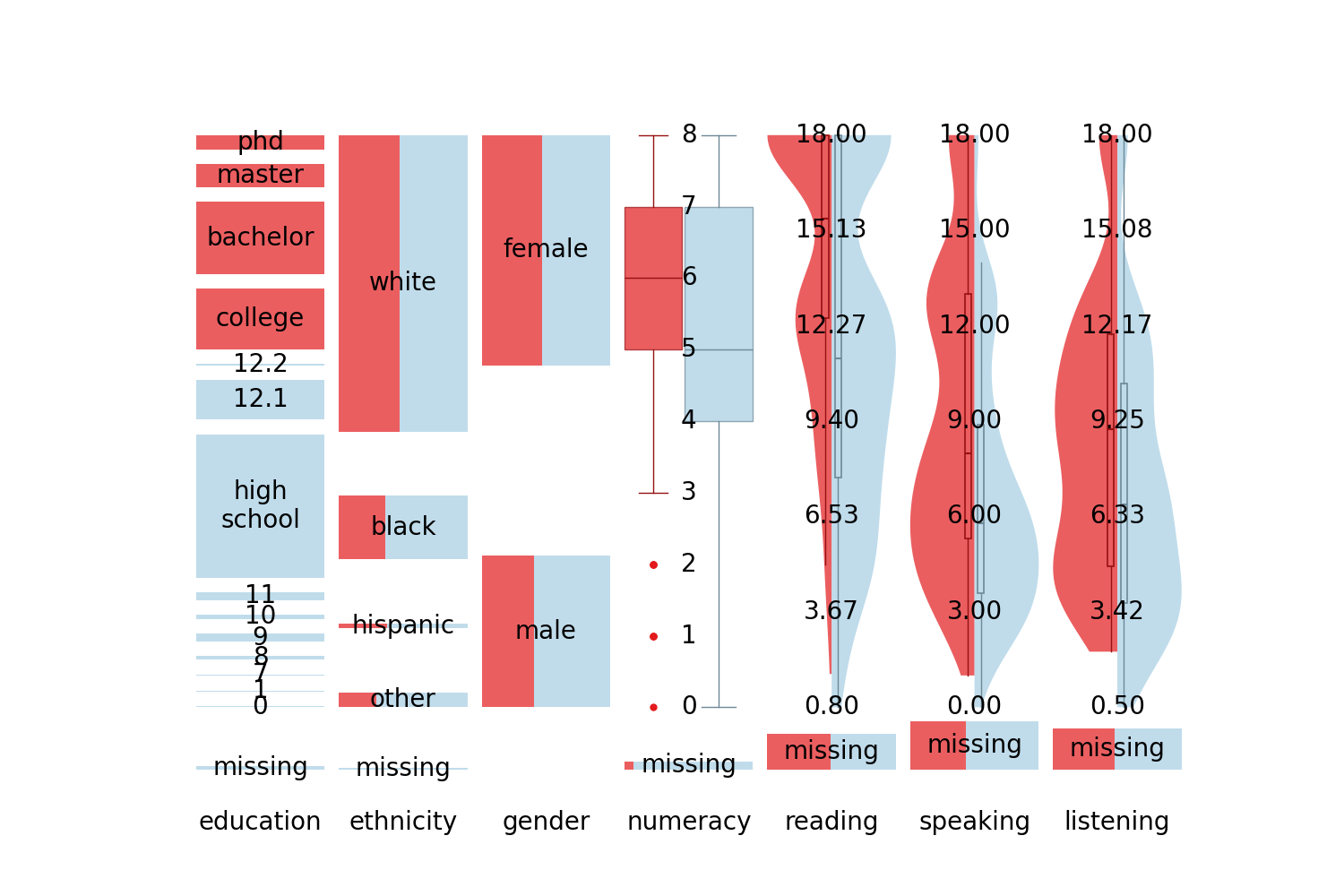
Fig 1: (a) Snapshot plot and (b) the corresponding “Table 1” of the literacy study. Here, the snapshot
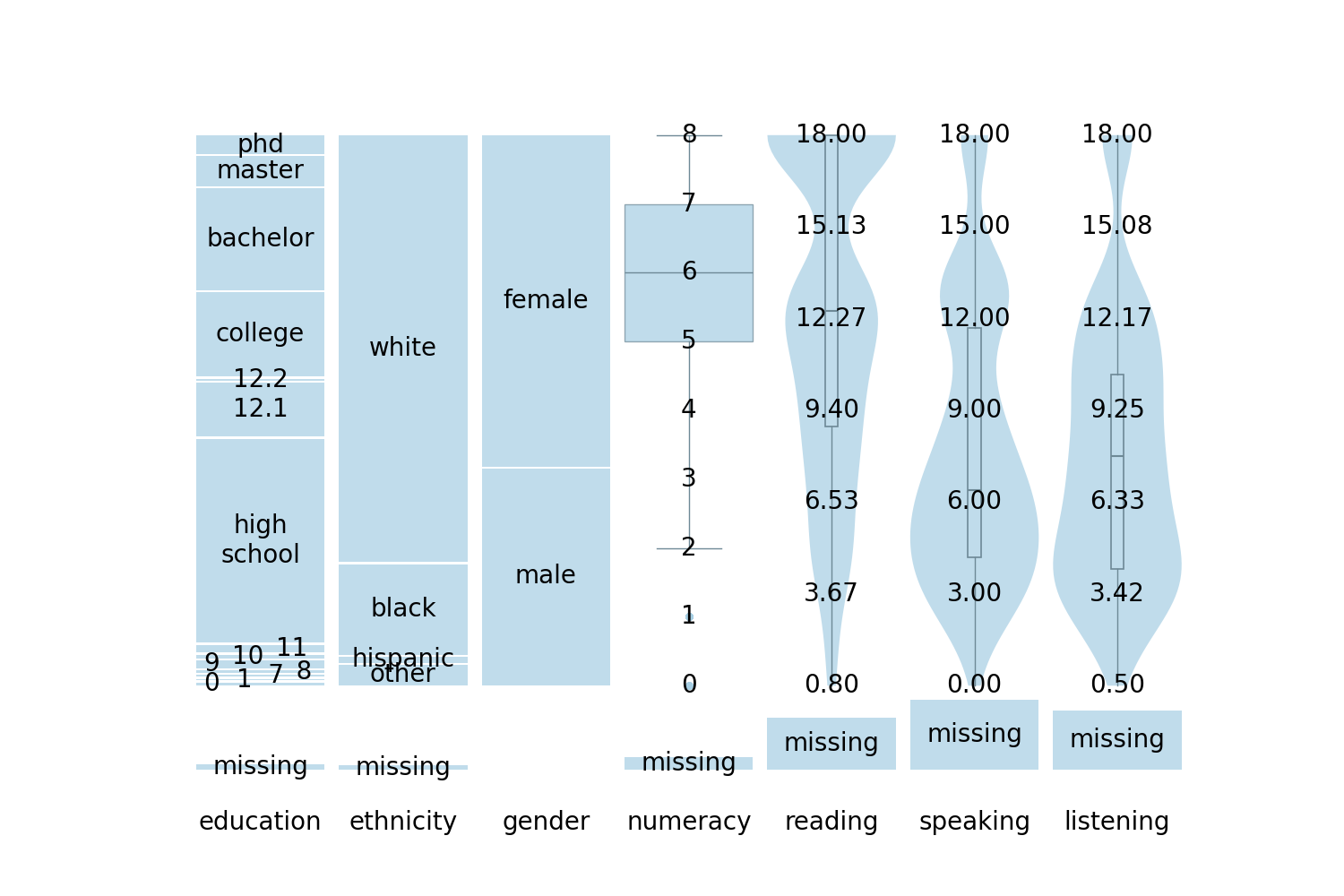
Fig 2: Snapshot plot of the literacy data with box and violin plots for numerical variables and stacked
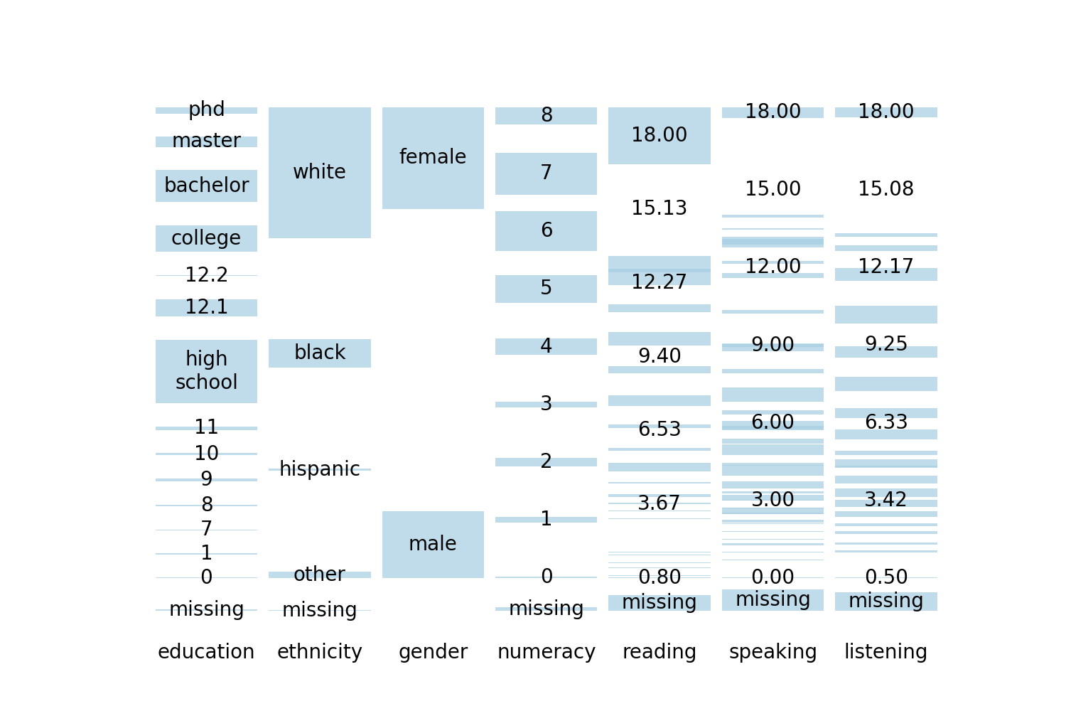
Fig 3: A snapshot plot of the literacy data. For numerical variables, this graph shows what we call lumpy
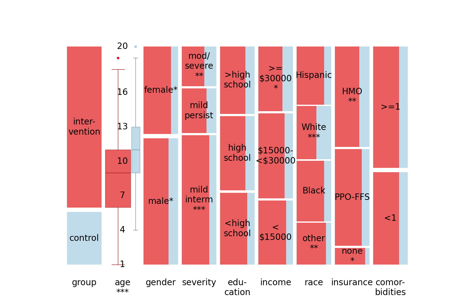
Fig 4: Snapshot plot of the sample characteristics for the asthma data.
Limitations
- Snapshot plots may not accommodate very long tables easily; landscape mode may help but spatial constraints remain.
- Designed for marginal summaries, snapshot plots do not visualize measures of uncertainty such as confidence intervals often found in results tables.
- For datasets with very large numbers of categorical indicator variables, snapshot plots require one column each and can become less effective than tables.
- No formal user study or empirical evaluation of snapshot plot effectiveness compared to traditional tables was performed; effectiveness claims remain qualitative.
- Highlighting complex multi-group or continuous selections may require further tool interface development.
- The approach assumes complete or imputed data for missing value visualization; no explicit handling of complex missing data patterns.
Open questions / follow-ons
- How effective are snapshot plots in improving user comprehension and decision-making compared to traditional Table 1s via empirical user studies?
- Can snapshot plots be extended to visualize uncertainty intervals or confidence measures alongside distributions?
- What interaction techniques could best support complex highlighting and selection for exploratory analysis with snapshot plots?
- How well do snapshot plots perform visually and computationally on datasets with dozens of variables or hundreds of categories?
Why it matters for bot defense
While this work does not directly address bot defense or CAPTCHA generation, it illustrates a novel visualization technique for summary statistics tables — a common output format in many empirical research pipelines. Bot-defense engineers or CAPTCHA designers analyzing large-scale user study or traffic datasets with categorical and numerical covariates may benefit from snapshot plots to visually compare group-level background characteristics quickly and intuitively. This could aid understanding demographic or behavioral differences between human users and automated bots under various conditions. The Python implementation and scalability to large data enable integration into data pipelines or dashboards that monitor or analyze CAPTCHA interactions. However, snapshot plots do not address adversarial bot detection directly.
Cite
@article{arxiv2607_28302,
  title={ Snapshot plots: displaying summary tables as parallel univariate plots with consistent color highlighting },
  author={ Matthias Schonlau and Sandra Huang and Tiancheng Yang },
  journal={arXiv preprint arXiv:2607.28302},
  year={ 2026 },
  url={https://arxiv.org/abs/2607.28302}
}