
A good captcha mobile ui should feel almost invisible: readable, tap-friendly, fast on slower networks, and strict enough that bots do not get a free pass. If your challenge forces pinch-zooming, tiny tap targets, or awkward text entry, you are usually optimizing for the wrong thing. The goal is not “make it harder for humans”; it is “make it easy for humans and expensive for automation.”
Mobile is where that balance gets tricky. Small screens compress layout, keyboard behavior changes the viewport, and network delays make heavy challenge assets feel much worse than they do on desktop. The best pattern is a responsive challenge surface with clear instructions, minimal typing, accessible controls, and backend validation that does the real security work.
What makes captcha mobile ui succeed or fail
The biggest mistake in captcha mobile ui is treating the mobile browser like a shrunken desktop browser. On a phone, every extra second and every extra gesture matters. A challenge that looks “simple” on a laptop can become frustrating when the on-screen keyboard covers the widget or when a checkbox is too close to the edge of the viewport.
A practical mobile-first design usually depends on four things:
Touch targets that meet mobile ergonomics
Keep interactive elements large enough for thumbs, with enough spacing to avoid accidental taps. Small arrows, checkbox corners, and dense grids are all common failure points.Responsive layout that does not reflow mid-challenge
Challenge containers should reserve space up front so loading states do not shift the page. Sudden layout jumps are especially annoying when a user is midway through signing up or checking out.Low-friction instructions
Mobile users scan, they do not read paragraphs. A short prompt like “Tap the images that match” or “Complete the verification” works much better than a long explanation.Fast fallback behavior
If the network is slow, the UI should show progress quickly and degrade gracefully. Nothing kills trust faster than a blank white box where verification should be.
This is where the distinction between presentation and verification matters. The UI should be lightweight; the security decision should happen on the server. That separation keeps the captcha mobile ui usable while still making automation costly.
Comparing common CAPTCHA patterns on mobile
Different systems behave differently on small screens, and the right choice depends on your app’s audience and risk profile. Here is a simple comparison from a defender’s point of view:
| Approach | Mobile UX | Security posture | Notes |
|---|---|---|---|
| reCAPTCHA | Mixed | Strong, widely deployed | Often familiar to users, but the experience can feel heavy or variable on mobile. |
| hCaptcha | Mixed to good | Strong | Common in high-risk flows; challenge variety can increase friction on small screens. |
| Cloudflare Turnstile | Good | Strong | Usually less intrusive; often fits mobile flows well when you want lower user friction. |
| Custom captcha mobile ui | Depends on implementation | Depends on backend | Best when you control the layout, accessibility, and validation logic end to end. |
For most product teams, the important question is not “which brand do I pick?” but “how much friction can I tolerate at this step?” Login, signup, password reset, and account recovery all have different risk levels. A checkout page might only need a lightweight signal, while a credential-stuffing hotspot may justify a more involved challenge.
If you are building your own flow, it helps to separate the mobile UI from the actual validation pipeline. CaptchaLa is designed around that separation: the challenge can be embedded in a native app or web flow, while validation happens server-side with your own application keys and secrets. That keeps first-party data in your control and avoids treating the frontend as a trust boundary.

Mobile implementation details that matter
A polished captcha mobile ui is mostly about removing edge cases before users notice them. Here are the implementation details that usually make the biggest difference.
1. Keep the challenge container stable
Reserve height for the widget before the loader appears. That prevents page content from jumping when the challenge finishes loading. If you are using a web embed, the loader can be pulled from https://cdn.captcha-cdn.net/captchala-loader.js, which helps keep the client integration straightforward.
2. Support the platforms your users already use
If your app spans browser and native surfaces, a single challenge experience is rarely enough. CaptchaLa supports native SDKs for Web (JS, Vue, React), iOS, Android, Flutter, and Electron, plus 8 UI languages. That matters because mobile friction is often linguistic as much as visual.
3. Validate on the server, not the client
The client should only collect the pass token; the server should decide whether it is valid. A typical validation call looks like this:
# Validate a completed challenge from your backend
POST https://apiv1.captcha.la/v1/validate
Headers:
  X-App-Key: your_app_key
  X-App-Secret: your_app_secret
Body:
  {
    "pass_token": "token_from_client",
    "client_ip": "203.0.113.42"
  }
That pattern keeps the trust decision where it belongs. You can also issue server-side challenge tokens when you need to coordinate a protected action:
# Request a server-token for a challenge flow
POST https://apiv1.captcha.la/v1/server/challenge/issue
4. Tune for accessibility
Accessibility is not a “nice to have” on mobile; it is central to whether a challenge is usable. Make sure focus order is sensible, labels are readable, and time limits are not punitive. If the interaction depends on color alone or assumes precise pointer movement, it will frustrate users on a phone.
5. Treat analytics as a design tool
If users repeatedly abandon the challenge on a specific device class or locale, that is a UI signal, not just a support issue. Measure completion rate, time to completion, and retry frequency. A spike in retries can indicate a layout problem, a touch-target issue, or an overly aggressive risk threshold.
Integration choices for mobile teams
The operational side matters as much as the visual side. Teams often want a simple path from prototype to production, and it helps to choose SDKs and server helpers that match the stack already in use.
For native and cross-platform apps, CaptchaLa publishes package coordinates and SDKs that fit common workflows:
- Maven:
la.captcha:captchala:1.0.2 - CocoaPods:
Captchala 1.0.2 - pub.dev:
captchala 1.3.2 - Server SDKs:
captchala-php,captchala-go
That means a mobile team can keep the frontend experience native while still using a predictable validation model on the backend. If you are comparing implementation effort across providers, this is one of the most useful filters: how much UI work is required, and how much of the security logic can stay on your server?
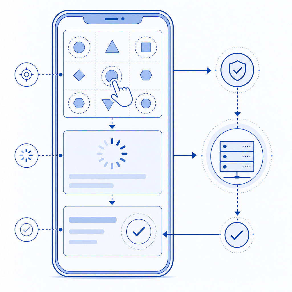
For example, a mobile signup flow might look like this:
- User opens the form.
- Challenge loads in a reserved container.
- User completes the tap-based or verification step.
- App receives a pass token.
- Backend validates the token with
POST /v1/validate. - The app proceeds only if validation succeeds.
That sequence is simple, but it is also robust. The UI stays responsive, and the security decision remains centralized.
Practical rules for your next mobile captcha
If you are redesigning a captcha mobile ui, these rules will keep you out of the usual traps:
- Use generous spacing and large tap areas.
- Avoid tiny text and multi-step instructions.
- Reserve layout space before loading the widget.
- Validate server-side with application credentials.
- Localize the UI for the languages your users actually speak.
- Keep the challenge short when the risk is low.
- Escalate only when behavior or context suggests automation.
It is also worth matching the challenge intensity to the endpoint. A login page with normal traffic may not need the same treatment as a referral form or signup endpoint under abuse. That is one reason teams often prefer configurable tools over hard-coded, one-size-fits-all checks. CaptchaLa’s plans are structured for that kind of scaling, from a free tier at 1000 monthly requests to Pro ranges around 50K-200K and Business at 1M, so teams can adapt the footprint as their traffic changes.
Where to go next: review the implementation notes in the docs or compare plans on the pricing page if you are mapping a mobile rollout.