
Captcha fun means a CAPTCHA that people can get through quickly without feeling blocked, confused, or punished for being human. The goal is not to make challenges silly for their own sake; it’s to make them clear, lightweight, and low-friction while still stopping automated abuse. When a challenge feels fair, users trust it more and support tickets drop.
That sounds simple, but the details matter. A good challenge balances speed, accessibility, and risk signals so legitimate users barely notice it, while scripted traffic runs into friction. Done well, it can even add a little relief to a tense login or signup flow: “oh, that was easy.”
What people actually mean by “captcha fun”
When someone says “captcha fun,” they usually do not mean entertainment in the gaming sense. They mean a CAPTCHA experience that is:
- Fast to solve.
- Easy to understand at a glance.
- Fair across devices and abilities.
- Less frustrating than the old “type the distorted letters” era.
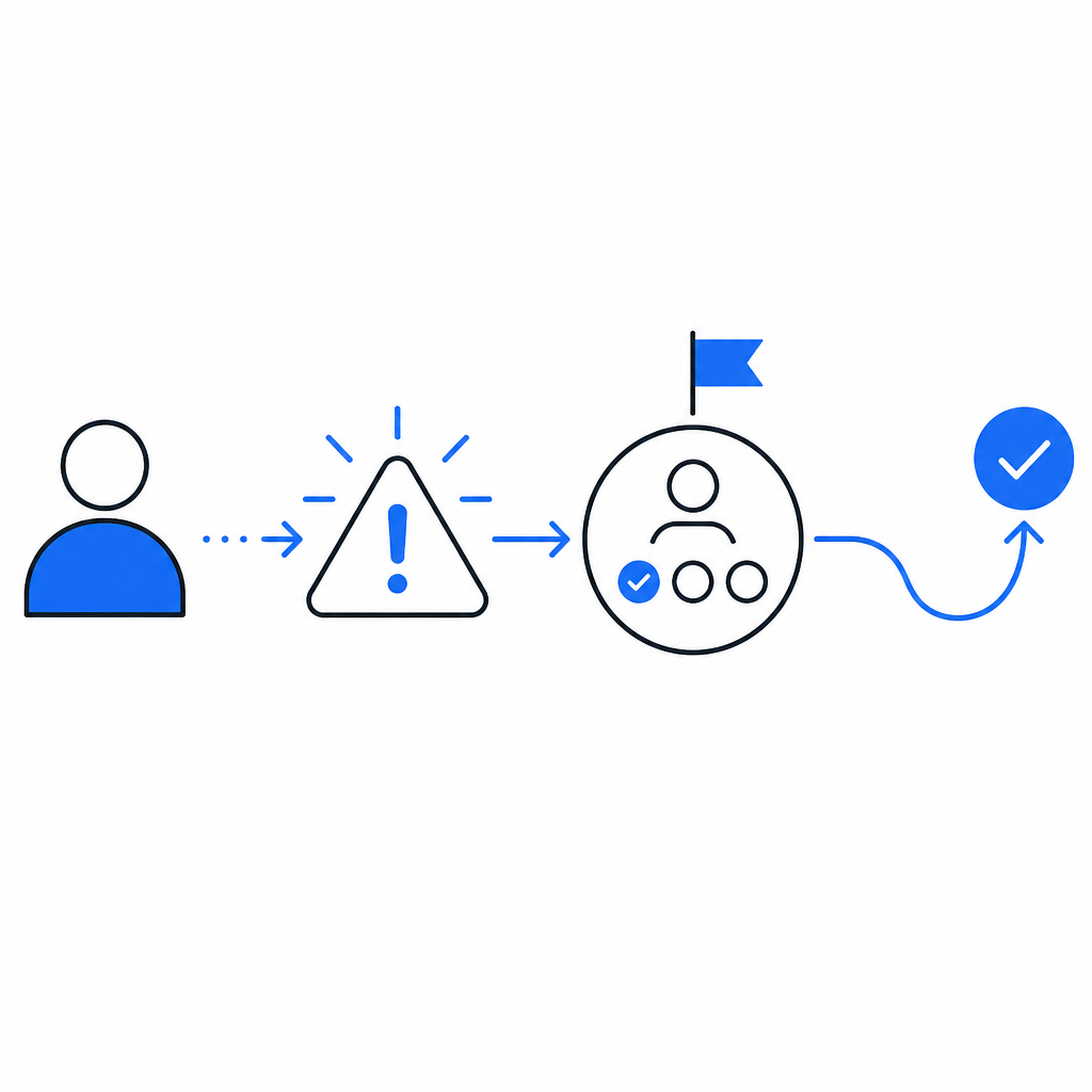
That matters because the old model was a tradeoff people tolerated: stronger bot resistance at the cost of user annoyance. Modern bot defense can do better by relying on a combination of challenge types, token validation, and contextual risk scoring. The best experiences feel almost invisible for low-risk users and only become more explicit when traffic looks suspicious.
A useful way to think about it is that “fun” is really shorthand for “good UX under pressure.” If a user is trying to reset a password, confirm a signup, or complete a checkout, they do not want a mini puzzle. They want to finish the task. CAPTCHA design should serve that goal, not compete with it.
The UX ingredients that make a challenge feel lighter
There are a few practical ingredients behind a smoother experience. None of them are flashy, but together they make the difference between a flow users tolerate and one they abandon.
1. Low cognitive load
A challenge should tell users exactly what to do in one glance. Ambiguity creates hesitation, and hesitation creates drop-off. If the visual pattern is cluttered or the instruction is unclear, users assume the system is broken rather than secure.
2. Consistent behavior across platforms
A challenge that feels fine on desktop but awkward on mobile is not really user-friendly. Touch targets, animation timing, and accessibility hooks need to behave predictably across browsers and devices. That’s why support for Web, iOS, Android, Flutter, and Electron matters in practice, not just on paper.
3. Fast verification
The user-facing challenge is only half the story. The server-side validation path has to be simple enough that teams can wire it in without inventing custom glue. A straightforward validation flow reduces implementation errors, which in turn reduces accidental friction.
4. Risk-based escalation
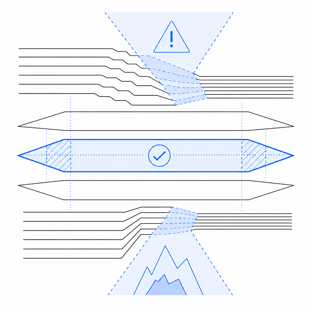
Not every visitor deserves the same level of friction. If a session looks normal, keep the challenge light. If signals point to automation, raise the bar. That principle is why modern systems often combine client challenge tokens with server checks.
5. Accessibility and localization
A CAPTCHA that ignores language and accessibility needs excludes real users. Supporting multiple UI languages and making interactions readable across contexts is part of making the experience feel humane instead of punitive.
Here’s a quick comparison of the common patterns teams evaluate:
| Approach | User feel | Bot resistance | Integration effort | Notes |
|---|---|---|---|---|
| Distorted text CAPTCHA | High friction | Moderate | Low | Familiar, but often frustrating and accessibility-unfriendly |
| Image-selection challenge | Moderate friction | Moderate to high | Medium | Better than text, but can still be tiring |
| Invisible/risk-based check | Low friction | High when paired with signals | Medium | Good for clean traffic; needs solid telemetry |
| Turnstile-style verification | Low friction | High | Medium | Often smooth, with minimal user interruption |
| reCAPTCHA-style flows | Low to moderate friction | High | Medium | Widely recognized; UX varies by deployment |
| hCaptcha-style flows | Moderate friction | High | Medium | Often used where operator control and privacy posture matter |
The right choice depends on your abuse pattern, audience, and platform mix. The point is not to chase novelty. It is to reduce unnecessary interaction while keeping fraud and automation in check.
Making “fun” measurable instead of vague
“Fun” can sound subjective, so it helps to translate it into metrics. If you are responsible for a login, signup, ticketing, or checkout flow, watch these numbers:
- Challenge completion rate.
- Median time to pass.
- Drop-off rate after challenge start.
- Support requests mentioning “captcha,” “verification,” or “can’t continue.”
- False positives on trusted users or repeat customers.
If those numbers improve together, your CAPTCHA experience is probably getting better. If completion rate rises but abuse spikes, you may have made the challenge easier without strengthening the surrounding checks. If abuse falls but support tickets climb, the system may be too aggressive or too confusing.
A good defender’s mindset is to treat the challenge as one layer in a larger control system. The challenge itself should be simple; the decisioning behind it can be smarter. For example, you can use session reputation, rate signals, IP context, and server verification to avoid making every human solve the same puzzle.
Here is a minimal server-side validation sketch to illustrate the flow:
# English comments only
# Send the pass token and client IP to the validation endpoint
# Include your app key and secret in headers
import requests

url = "https://apiv1.captcha.la/v1/validate"
payload = {
    "pass_token": "token_from_client",
    "client_ip": "203.0.113.10"
}
headers = {
    "X-App-Key": "your_app_key",
    "X-App-Secret": "your_app_secret"
}

response = requests.post(url, json=payload, headers=headers)
result = response.json()

# Accept only if validation says the token is valid
if result.get("ok"):
    print("Challenge passed")
else:
    print("Challenge failed")
For teams that want to issue server-side challenge tokens first, the flow can start with POST https://apiv1.captcha.la/v1/server/challenge/issue and then validate the returned pass token on the backend. CaptchaLa documents these paths clearly, which helps when you are wiring them into existing auth or signup logic.
How different providers shape the experience
People often compare CAPTCHA providers only on whether they stop bots. That is important, but it is not the whole experience. The surrounding product choices shape how “fun” or frustrating the challenge feels.
- reCAPTCHA is widely known and easy to recognize, which can reduce user confusion, but the exact UX depends heavily on configuration and risk levels.
- hCaptcha is often chosen for a different privacy or operator-control posture; its challenge style can feel more explicit than invisible approaches.
- Cloudflare Turnstile tends to emphasize low-friction verification, especially when traffic looks clean.
If you are evaluating options, look at the whole path: challenge presentation, localization, SDK support, backend validation, and the ease of integrating the token into your own first-party systems. That last part matters more than people expect. If your workflow forces extra hops or custom parsing, the user experience gets worse even if the challenge itself is elegant.
CaptchaLa’s current setup is fairly direct on that front: the loader is served from https://cdn.captcha-cdn.net/captchala-loader.js, validation happens via POST https://apiv1.captcha.la/v1/validate, and the product supports native SDKs for Web, iOS, Android, Flutter, and Electron. It also offers server SDKs for captchala-php and captchala-go, plus package options such as Maven la.captcha:captchala:1.0.2, CocoaPods Captchala 1.0.2, and pub.dev captchala 1.3.2. That kind of coverage makes it easier to keep the challenge experience consistent across the stack.
The real secret: reduce friction where you can, add friction where you must
The best CAPTCHA experiences are not trying to be cute. They are trying to be respectful. Users should only see friction when the risk justifies it, and even then the prompt should be brief, legible, and predictable.
That means:
- Keep the challenge short.
- Validate on the server, not just in the browser.
- Reuse context so returning users are not treated like strangers every time.
- Localize the UI.
- Measure false positives aggressively.
- Prefer clean fallback states over dead ends.
If you do that, “captcha fun” stops being a joke and becomes a real product quality goal. The user gets back to their task, your team gets fewer complaints, and your abuse controls stay intact.
For teams planning next steps, the docs are the fastest way to map the integration flow, and the pricing page is useful if you want to match traffic volume to a plan.