
A good captcha font is one that humans can read quickly under slight distortion while automated systems get little consistent structure to exploit. In practice, that means balancing legibility, variability, spacing, and contrast—not picking the fanciest typeface.
If you’re designing a CAPTCHA or reviewing one from a security and UX angle, the font is not a decorative detail. It directly shapes solve time, abandonment, accessibility complaints, and how much room you give attackers to train on repeated patterns.

What a captcha font actually does
A captcha font serves two jobs at once: it communicates characters to a human and introduces enough ambiguity that simple automation has a harder time reading them. That tension is why “just use a weird font” is usually the wrong instinct.
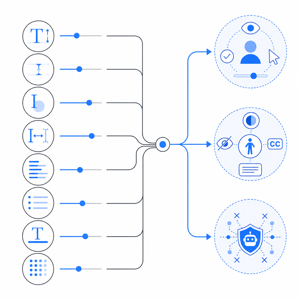
There are a few properties that matter more than the font name itself:
Glyph distinguishability
Characters likeOand0,Iandl, orSand5need enough separation that a human can still infer them reliably.Stroke regularity
Fonts with highly repetitive strokes can become easier for OCR models to normalize. Overly uniform geometry can be a liability.Kerning and spacing
Tight spacing can increase confusion, but too much spacing makes the challenge easier to segment programmatically.Noise interaction
A font that looks fine on its own may become unreadable once layered with warping, backgrounds, or interference lines.Accessibility impact
If your challenge is routinely failing for low-vision users or multilingual users, the font choice may be part of the problem.
In other words, the font should be one part of a broader challenge design, not the entire defense.
How to evaluate a captcha font without guessing
When teams choose a captcha font by feel, they often optimize the wrong thing. The real test is whether the challenge remains usable under real conditions: small screens, bright outdoor light, browser zoom, and different device pixel densities.
A practical review process looks like this:
1. Test readability at the smallest supported size
Render the challenge at the minimum size you allow on mobile. If a character starts merging with another, the font is too delicate for the job.
2. Check character confusion pairs
Pay special attention to sets that are commonly confused:
0/O1/l/I2/Z5/S6/G8/B
A captcha font does not need to eliminate all ambiguity, but it should avoid making the confusing pairs identical.
3. Validate across rendering engines
Fonts can look different in Chrome, Safari, Firefox, and embedded webviews. If your application spans desktop and mobile, test on each major rendering path.
4. Measure solve time and retry rate
A font that feels “secure” but causes a high retry rate is a bad trade. Watch:
- average solve time
- abandon rate
- retry count per session
- support complaints about readability
5. Compare against actual attack surface
OCR models, layout parsers, and multimodal systems are not defeated by visual oddity alone. If your defense depends on a font being “hard to recognize,” you should assume that assumption will age poorly.
Here’s a simple comparison framework teams can use:
| Font characteristic | Human readability | Bot resistance value | Accessibility risk | Notes |
|---|---|---|---|---|
| High contrast, clean strokes | High | Low to medium | Low | Good for usability, weak as a standalone defense |
| Slightly irregular strokes | Medium to high | Medium | Low to medium | Often a balanced choice |
| Heavy distortion-sensitive forms | Low to medium | Medium | High | Can frustrate users faster than bots |
| Decorative/novelty styling | Low | Low | High | Usually a poor choice for CAPTCHA text |
The main takeaway: a captcha font should be evaluated as part of a system, not as a standalone obstacle.
What makes a captcha font usable and safer
If you want a challenge that works well for humans and doesn’t become predictably easy for automation, aim for controlled variation rather than maximal weirdness.
Prefer these traits
- Distinct internal shapes: letters and digits should remain recognizable even with minor warping.
- Moderate stroke thickness: thin strokes vanish under scaling; overly thick strokes merge.
- Stable baseline: a modest amount of rotation is fine, but excessive tilt hurts all users.
- Clear counters: the enclosed spaces in characters like
a,e,o,P, andBhelp human recognition. - Avoiding repeated templates: if every challenge uses the same font and same rendering pattern, models can learn it.
Avoid these mistakes
- Using one decorative font forever
- Making every character look “broken” in the same way
- Adding so much noise that screen readers and low-vision users are effectively blocked
- Relying on the font as your primary defense instead of server-side validation and behavioral signals
A more robust approach is to treat the text layer as only one signal. Modern bot defense usually combines challenge presentation with server verification, token validation, and policy logic. If you’re implementing your own flow, CaptchaLa’s SDKs and docs are useful references for how that can fit into a broader stack without overcomplicating the client side.
Font choice versus full CAPTCHA architecture
People often ask whether the “right” captcha font can solve the bot problem. Short answer: no. It can improve the experience and add some friction, but durable defense comes from architecture, not typography alone.
Here’s a simple way to compare common approaches:
| Approach | What it emphasizes | Strengths | Limitations |
|---|---|---|---|
| reCAPTCHA | risk scoring and ecosystem signals | Familiar to many teams, broad adoption | Can create UX friction and depend on external signals |
| hCaptcha | challenge-based verification | Flexible challenge formats | Still requires careful UX tuning |
| Cloudflare Turnstile | low-friction verification | Smooth user experience | Integration and policy fit depend on your stack |
| Custom CAPTCHA font design | visual ambiguity | Easy to prototype | Weak if used in isolation |
The better question is not “Which font stops bots?” but “How much friction can we add before users suffer, and how do we verify the result server-side?”
For example, a typical validation flow should not trust the browser alone. A server receives a token, checks it, and decides whether the user proceeds. If you’re building with CaptchaLa, the basic idea is straightforward: the client gets a pass token, and your backend validates it with your app credentials. The docs walk through the flow and integration options in more detail: docs.
If you are designing a CAPTCHA from scratch, keep the following architecture in mind:
Client renders challenge
Client receives pass token after successful completion
Backend sends pass_token + client_ip to validation endpoint
Server checks response before allowing sensitive action
That pattern matters more than a clever font. A readable font plus reliable validation is better than an unreadable font and loose trust checks.
Practical guidance for teams shipping CAPTCHA today
If you need to choose a captcha font or review an existing one, use this checklist:
Start with accessibility
- Can a human complete it on a phone without zooming?
- Does it work for users with mild visual impairments?
- Is there a fallback path?
Minimize fixed patterns
- Do not use the same character spacing, tilt, and warp every time.
- Keep the font family consistent enough for usability, but vary the rendering.
Reduce dependence on text-only challenges
- If your risk level is high, combine the text layer with server-side verification and other signals.
- Don’t assume a weird typeface can outperform real abuse logic.
Instrument the experience
- Track completion rate, retries, latency, and abandonments.
- Review these metrics by device class and locale.
Choose integration that matches your stack
- Web apps, mobile apps, and hybrid apps have different rendering constraints.
- CaptchaLa supports Web SDKs for JS/Vue/React, native SDKs for iOS and Android, Flutter, and Electron, which makes it easier to keep the challenge consistent across surfaces.
- If you’re on Java, iOS, or Flutter, the named package versions matter: Maven
la.captcha:captchala:1.0.2, CocoaPodsCaptchala 1.0.2, and pub.devcaptchala 1.3.2.
For backend verification, the important part is keeping the trust decision server-side. CaptchaLa’s validation endpoint uses POST https://apiv1.captcha.la/v1/validate with {pass_token, client_ip} and the X-App-Key / X-App-Secret headers. There is also a server-token flow at POST https://apiv1.captcha.la/v1/server/challenge/issue for setups that need a more direct server-driven issuance step. That matters more than the exact typeface you choose.
If you’re comparing plans, first-party data usage and cost limits can also shape implementation strategy. CaptchaLa’s published tiers include a free tier at 1,000/month, Pro at 50K–200K, and Business at 1M, which is useful when you’re deciding whether to test a custom flow or standardize on a managed one. See pricing.
Closing thoughts
A captcha font should be readable enough for real users, varied enough to avoid trivial pattern matching, and modest enough not to become the entire security story. If you treat typography as one layer in a server-verified defense system, you get a better balance of usability and resilience.
Where to go next: review the integration details in the docs or compare plan limits on pricing.