
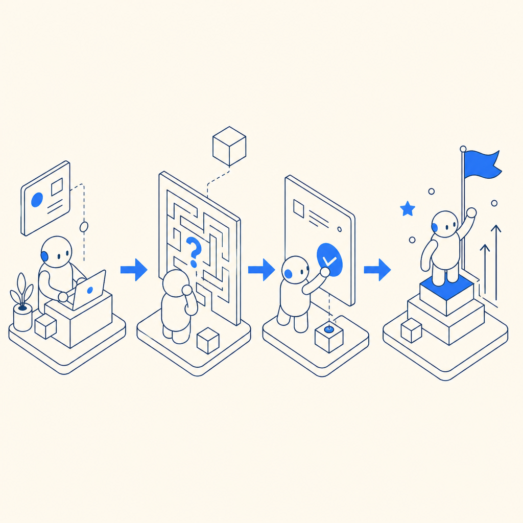
Captcha comics are short, visual stories that explain why a site uses CAPTCHA or bot defense, how a challenge works, and what users should expect next. Used well, they turn a security step from a mystery into a quick, understandable moment.
Why captcha comics work
Most people do not object to security checks themselves; they object to confusion. A CAPTCHA challenge feels frustrating when users cannot tell whether it is normal, temporary, or safe. That is where captcha comics help: they reduce uncertainty with a simple visual narrative.
For product teams, the value is not just “making things cute.” A comic-style explanation can improve completion rates because it sets expectations before the challenge appears. It can also lower support tickets by answering questions users would otherwise send to your team: Why am I being challenged? What happens to my data? Is this a scam?
There is a second benefit that matters a lot for trust: comics are easy to localize and reuse. With a small set of panels, you can adapt the same story for onboarding pages, help centers, or inline challenge education across different markets and device sizes.
What a good captcha comic should say
A useful captcha comic should explain the security flow without sounding technical or evasive. The goal is clarity, not a marketing pitch. Keep the story focused on four questions:
- Why is the challenge here?
- What should the user do?
- What happens after success?
- What data is used?
If you are working on bot defense, especially for signup, login, ticketing, or checkout, the comic should match the real behavior of your system. That means the panels should reflect the actual sequence: browser loads a challenge, user completes it, your server validates the result, and the app either continues or requests another step.
A practical pattern is to make the comic do one job only: explain the challenge. Do not cram in product features, security jargon, or policy text. If you need detailed implementation help, link from the comic to a docs page rather than trying to teach everything inline.
A simple structure that works
Here is a compact structure you can reuse:
- Panel 1: “We check for automated abuse.”
- Panel 2: “You complete a quick challenge.”
- Panel 3: “We verify the result on the server.”
- Panel 4: “You continue using the site.”
That sequence mirrors how most modern bot-defense systems work, whether you are using CaptchaLa, reCAPTCHA, hCaptcha, or Cloudflare Turnstile. The important part is being truthful about the flow your users actually experience.
Comparing comic-style explanations with other UX patterns
Not every site needs a comic, but many benefit from some kind of visual explanation. Here is a quick comparison of common approaches:
| Approach | Strengths | Weaknesses | Best use case |
|---|---|---|---|
| Text-only notice | Fast to ship, easy to localize | Easy to ignore, often too vague | Simple help text near a form |
| Inline tooltip | Lightweight, contextual | Can be overlooked on mobile | Known forms with low-risk actions |
| Captcha comic | Memorable, explanatory, friendly | Needs careful design to avoid clutter | First-time users, public-facing flows |
| Full help article | Detailed and searchable | Too long for the moment of friction | Documentation and support pages |
The biggest difference is timing. A help article explains the policy after the question appears. A comic can explain it before the user feels stuck. That is especially useful if your site serves mixed audiences, such as new visitors, returning users, and enterprise admins.
If you use a comic as part of a signup or login flow, keep the visual language aligned with the product. A playful illustration style can be fine, but the copy should remain direct. Users should come away thinking, “Okay, I understand why this step exists,” not “What exactly did I just agree to?”
Making the comic match the real technical flow
A comic is only helpful if it maps to reality. If your implementation uses a client-side loader, server-side validation, and an anti-abuse token exchange, the story should reflect that sequence in plain language.
For example, if you are integrating a CAPTCHA flow with CaptchaLa, the browser loads the challenge script from the loader endpoint, the user completes the challenge, and your server validates the pass token with the relevant app credentials. That is a straightforward story to tell visually, and it helps developers and non-developers stay on the same page.
You can even pair the comic with a short developer note. Here is a simplified example of the logic your documentation might describe:
# English comments only

1. Load the challenge on the client
2. Wait for the user to complete it
3. Send the pass token to your server
4. Validate the token server-side
5. Allow the request only if validation succeeds
If you are documenting the integration, it helps to be specific about the actual endpoints and SDK options. CaptchaLa supports Web SDKs for JS, Vue, and React, as well as iOS, Android, Flutter, and Electron. It also offers server SDKs for PHP and Go, which makes it easier to keep validation logic on your backend instead of in the browser.
Technical details worth reflecting in your story
A comic does not need to show API calls, but your surrounding copy should be consistent with them. For instance:
- Validation can be described as a server-side check after the user finishes the challenge.
- The pass token should be treated as short-lived proof, not a reusable credential.
- Client IP can be part of the validation request when your architecture requires it.
- First-party data handling should be part of the trust message if that is how your product operates.
If you are using a documentation-first approach, link users from the comic to the implementation guide. That way the comic stays lightweight while the docs handle the specifics. For teams building their own defensive flow, docs is the natural place to keep the technical reference.
Where captcha comics fit in a real product
Captcha comics are most useful in places where friction is already expected:
- Signup and account creation
- Password reset flows
- Login after suspicious activity
- High-value forms such as checkout or ticket requests
- Admin panels and internal tooling
They can also work well as a “what just happened?” explanation after a challenge succeeds. A short final panel can reassure users that the check is finished and that they can continue normally. That matters because many users are less worried about the challenge itself than about whether their input was accepted.
From a product standpoint, you do not need a comic for every journey. A focused comic near a high-friction step is enough. If your site sees occasional abuse but has very low tolerance for false positives, clarity is worth a lot. That is true whether you are running reCAPTCHA, hCaptcha, Cloudflare Turnstile, or a system like CaptchaLa.
One practical note: if you plan to test different explanation styles, treat the comic like any other UX component. Measure completion rate, abandonment, support contacts, and time-to-success. The best explanation is the one that helps real users continue without feeling tricked.

A small content pattern you can copy
If you want a compact caption or intro block next to a comic, try this style:
- State the purpose in one sentence.
- Explain the user action in one sentence.
- Explain the outcome in one sentence.
- Link to docs for details.
For example: “We use a quick challenge to block automated abuse. Complete it once, and we will verify it on our server so you can continue. If you want the technical details, see the docs.”
That phrasing is honest, short, and easy to translate. It also avoids overpromising. Users do not need a lecture on bot patterns; they need a simple reason to trust the step in front of them.
If you are evaluating a provider, pricing and volume also matter because the comic usually lives near a real production flow. CaptchaLa’s published tiers are Free for 1,000 monthly checks, Pro for 50K–200K, and Business for 1M, which makes it easier to match explanation design with expected traffic. You can review those details on pricing when planning rollout scope.
Conclusion
Captcha comics are not a gimmick when they are done with a defender’s mindset. They make security easier to understand, reduce anxiety at the moment of friction, and help users complete legitimate actions with less guesswork. The best versions stay short, honest, and visually simple, while the real technical detail lives in your product docs.
Where to go next: if you are planning a rollout or documenting an existing challenge flow, start with the docs or check pricing to match the setup to your traffic.